our logo

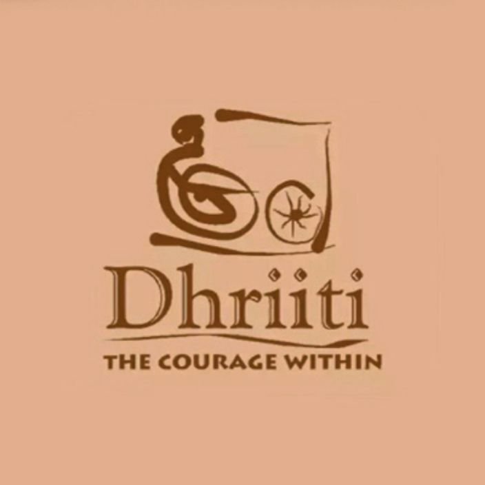
1st logo

The Charkha and the Gandhian ideology of entrepreneurship
The first logo draws inspiration from the charkha, a symbol deeply associated with self-reliance, empowerment, and sustainable livelihoods in Gandhian philosophy. The design features an abstract representation of a woman sitting beside a spinning wheel, evoking the idea of localized, self-sufficient economies. This logo reflects Dhriiti’s early vision of entrepreneurship as a means of livelihood generation, particularly for marginalized communities. The earthy colour tones and organic shapes further reinforce a grassroots, community-centric approach – one rooted in traditional wisdom, local craftsmanship, and self-sustenance.
At this stage, Dhriiti was deeply engaged in enabling small-scale entrepreneurs, especially those in handicrafts, bamboo-based enterprises, and rural industries, to create stable incomes through skill-based entrepreneurship. The focus was on financial independence at the individual and household level, much like Gandhi’s vision of empowering villages through self-sustaining economic models.
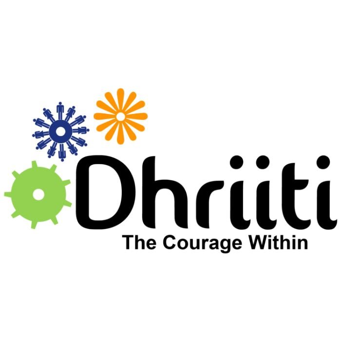
2nd logo

The startup ecosystem and the FSE approach
As Dhriiti’s understanding of entrepreneurship expanded, so did its visual identity. The second logo moves away from the charkha and adopts a modern, startup-driven aesthetic. The three distinct symbols – representing a gear (financial impact), a flower (ecological impact), and a network of people (social impact) – capture the evolution of Dhriiti’s approach to enterprise development.
This phase signifies Dhriiti’s shift towards a structured, systems-based understanding of entrepreneurship, where businesses are not just about livelihoods but also about creating sustainable, scalable impact across financial, social, and ecological dimensions. The bold, clean font and vibrant colours signal innovation, collaboration, and a growing engagement with the mainstream entrepreneurship ecosystem.
During this period, Dhriiti actively worked on incubation, training, and ecosystem-building, ensuring that entrepreneurship was not just a survival strategy but a growth-oriented, scalable, and impact-driven approach to economic development.
3rd logo
The Helix and Entrepreneurship for Resilience
Our latest logo represents Dhriiti’s evolution over 20 years, marking our transition from entrepreneurship for livelihoods to entrepreneurship for resilience. The helix design embodies continuity, adaptability, and evolution – essential qualities of resilient communities.
At the centre of the helix is a feminine face, symbolizing our fundamental belief that women are not merely program beneficiaries but central architects of economic resilience. This reflects our approach to program design, where we develop initiatives with women’s needs and perspectives integrated from the beginning, rather than as an afterthought to standard programs.
The warm burnt-orange colour conveys maturity and sustainability, reinforcing our expanded mission. We’ve moved beyond simply launching businesses to building support systems, fostering adaptability, and developing enterprises that serve as pillars of community resilience – capable of withstanding shocks, crises, and uncertainties.
This logo represents our deepened understanding that entrepreneurship is about nurturing resilient communities and economic ecosystems rather than just individual livelihoods or impact-driven businesses.
Conclusion: From survival to strength
Dhriiti’s logo transformation tells the story of its ideological, operational, and strategic evolution. It has moved from supporting individuals in their pursuit of survival to fostering entrepreneurs who can weather uncertainties and contribute to resilient economies.
This journey – from a Gandhian charkha to a modern startup ecosystem to a helix of resilience – captures the shift from entrepreneurship for livelihoods to entrepreneurship for resilience, a philosophy that now defines Dhriiti’s work.
